Try aesthetic iPhone photo editing recipes for fall, beach, portraits and golden hour, with starting settings and simple fixes for each look.
Your photo does not need twelve filters. It needs the right mood. Start with a soft beach glow, a rich autumn look, or a warm portrait—and use the matching settings below. Each recipe includes what to change when skin turns orange, shadows go too dark, or the result just feels a little… much.
Pick the look closest to your photo, try the seven settings, and compare. You do not have to scroll through every recipe before you can make your first edit.
These original recipes take inspiration from the supplied mood boards. The AI-generated cards illustrate each aesthetic; they do not show tested before-and-after results. Treat the numbers as starting settings, not guaranteed presets.
Find your photo’s mood first
- Fall photos: October Glow, Deep Fall, Soft Fall, or Cozy Autumn Portrait.
- Beach and travel: Pink Sunset, Moody Beach, Beach Dream, or Forest Glow.
- People and everyday moments: Sun-Kissed, Dark Warm, Golden Hour, or Digital Camera.
How to use these iPhone photo editing settings
Open your photo in the Photos app, tap Edit, then Adjust. Swipe through the controls, tap a setting, and move its slider. Apple’s guide describes this workflow and the option to compare your adjustment with the original.
Source: Apple’s photo-editing guide
- Start from the original photo, without an existing filter or earlier adjustments.
- Choose the recipe that matches the light and colors you already have.
- Enter the listed values. Leave unlisted controls at their starting values.
- Check brightness first, skin color second, and overall color third.
- If the effect feels too strong, halve the listed changes and compare again.
These values refer to the iPhone Photos adjustment sliders, not Lightroom exposure stops. A value such as Exposure −12 does not mean −12 EV. Avoid mixing numbers from different apps just because the control names sound similar.
The quick rescue: If you like the color but the photo feels too dark, ease Exposure toward 0 before changing every other slider. If brightness looks fine but skin looks orange, ease Warmth toward 0.
1. October Glow: Turn everyday fall photos into a cozy October mood
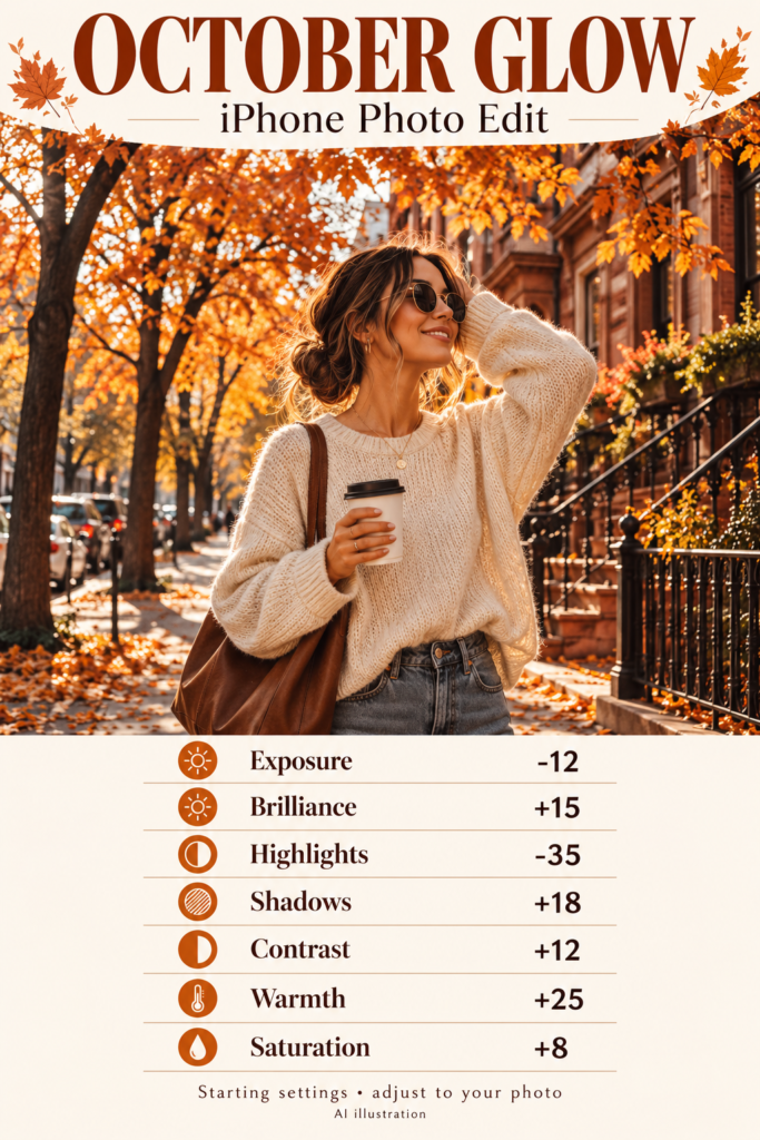
Best for: Autumn outfits, orange leaves, café tables, and brick streets.
You know that lovely fall walk that somehow looks a little gray in your camera roll? October Glow aims for warmer leaves and a little more depth without turning every surface orange. Start with an image that already contains autumn colors. Warmth can emphasize those colors; it cannot give a summer street a new season.
October Glow iPhone editing settings
| Adjustment | Starting value |
|---|---|
| Exposure | -12 |
| Brilliance | +15 |
| Highlights | -35 |
| Shadows | +18 |
| Contrast | +12 |
| Warmth | +25 |
| Saturation | +8 |
Try it in this order: Lower Highlights first to soften bright sky and pale clothing. Add Warmth, then bring Shadows up enough to keep your outfit visible. Finish with the small Saturation increase.
If it looks wrong: If your face or white sweater looks yellow, reduce Warmth toward +10. Keep the leaves warm without making your skin match the pumpkin display.
Start here if you want one versatile fall edit before trying a stronger mood.
2. Deep Fall: Give woodland photos a rich Deep Fall edit
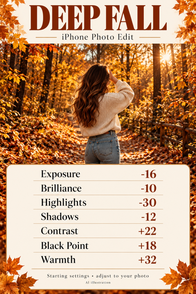
Best for: Amber foliage, overcast woodland walks, and photos with a bright subject.
Deep Fall pushes the mood toward darker browns and deeper oranges. It suits scenes with real texture: leaf-covered paths, tree trunks, wool sweaters, and weathered benches. A bright cream outfit gives the darker background something to frame.
Deep Fall iPhone editing settings
| Adjustment | Starting value |
|---|---|
| Exposure | -16 |
| Brilliance | -10 |
| Highlights | -30 |
| Shadows | -12 |
| Contrast | +22 |
| Black Point | +18 |
| Warmth | +32 |
Try it in this order: Reduce Exposure gently, then add Contrast and Black Point. Check your face before lowering Shadows. Use Warmth last so you can judge whether the darker photo needs more amber.
If it looks wrong: If hair and dark clothing merge into one shape, bring Shadows back toward 0 and lower Black Point. The point is depth, not losing half your outfit.
Choose this over October Glow when the background matters more than bright, airy skin tones.
3. Soft Fall: Try Soft Fall when you prefer light, gentle colors
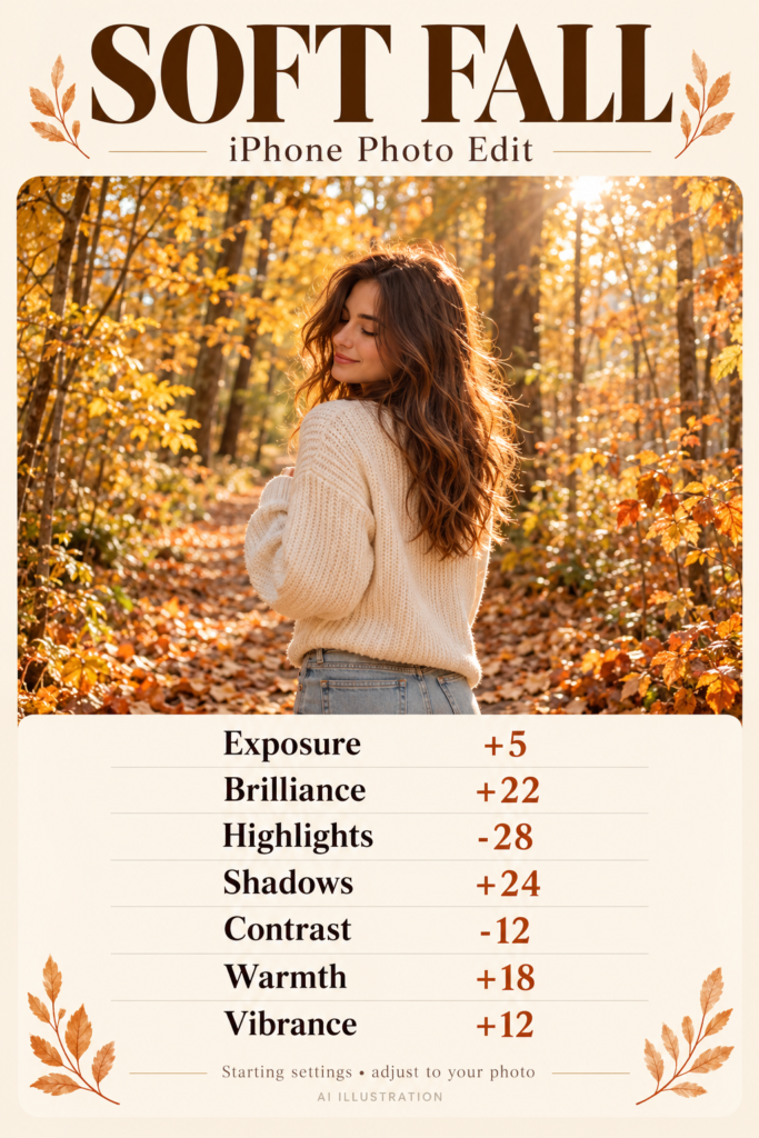
Best for: Cream outfits, pale foliage, light interiors, and softly lit portraits.
This is the lighter alternative to the dramatic autumn recipes. It keeps the seasonal warmth but softens the contrast. Think of a quiet Sunday walk, a knitted sweater, and a coffee you can actually drink before it goes cold.
Soft Fall iPhone editing settings
| Adjustment | Starting value |
|---|---|
| Exposure | +5 |
| Brilliance | +22 |
| Highlights | -28 |
| Shadows | +24 |
| Contrast | -12 |
| Warmth | +18 |
| Vibrance | +12 |
Try it in this order: Raise Brilliance and Shadows to open the darker areas, then lower Contrast slightly. Reduce Highlights to keep pale clothes from dominating the frame. Add only a modest amount of Warmth.
If it looks wrong: If the photo looks washed out, move Contrast toward 0 before adding more color. If the image already looks bright, leave Exposure at 0.
Use this for a softer feed or a portrait where you want the person to remain the main subject.
4. Cozy Autumn Portrait: Warm up portraits with a Cozy Autumn edit
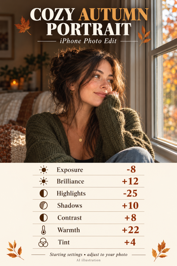
Best for: Window-light portraits, olive sweaters, brown hair, and neutral rooms.
Cozy Autumn Portrait brings warmth into a quieter scene. You do not need a forest or a pile of leaves. A plain wall, a cardigan, and light from a window can carry the whole look. Start with a face that already has enough light; editing cannot rescue every dim selfie.
Cozy Autumn Portrait iPhone editing settings
| Adjustment | Starting value |
|---|---|
| Exposure | -8 |
| Brilliance | +12 |
| Highlights | -25 |
| Shadows | +10 |
| Contrast | +8 |
| Warmth | +22 |
| Tint | +4 |
Try it in this order: Lower Highlights to soften bright skin and window areas. Raise Shadows a little, then add Warmth. Keep Tint close to neutral and use the small positive value only if the image looks slightly green.
If it looks wrong: If cheeks look too pink, return Tint toward 0. If skin looks orange, lower Warmth. Judge the face first and the room second.
Try it on a simple portrait before using it on a busy indoor scene.
5. Pink Sunset: Make dusk photos feel softer with Pink Sunset
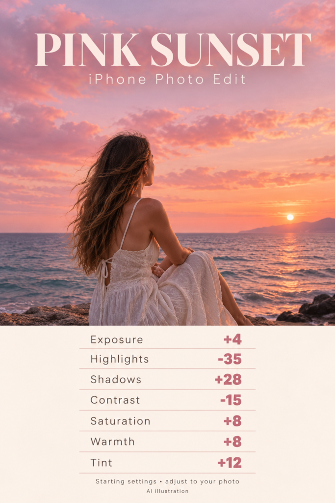
Best for: Existing pink skies, pastel clouds, and seaside photos near sunset.
Pink Sunset works with colors the scene already has. It can make a muted pink sky feel more noticeable and soften the overall mood, but it will not paint believable sunset clouds into a flat midday sky. Choose a photo with gentle evening light and some color to develop.
Pink Sunset iPhone editing settings
| Adjustment | Starting value |
|---|---|
| Exposure | +4 |
| Highlights | -35 |
| Shadows | +28 |
| Contrast | -15 |
| Saturation | +8 |
| Warmth | +8 |
| Tint | +12 |
Try it in this order: Reduce Highlights to bring down the brightest clouds. Lift Shadows so the subject does not disappear, then lower Contrast. Add Tint slowly; even a small change can affect the whole image.
If it looks wrong: If white clothing turns pink, reduce Tint toward +4 or 0. If the subject looks too flat, bring Contrast closer to 0.
Use this when the sky is the star and you want the person to feel part of the scene.
6. Moody Beach: Create a cooler, moodier beach photo
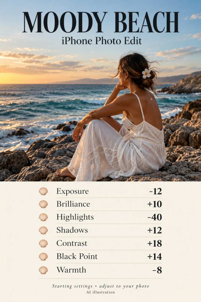
Best for: Blue water, rocky shorelines, cloudy beach days, and white outfits.
Moody Beach gives seaside photos a cooler, more defined finish. It is especially useful when bright water overwhelms the rest of the image. The lower Warmth setting nudges the scene cooler, while Contrast and Black Point give the rocks and clothing more separation.
Moody Beach iPhone editing settings
| Adjustment | Starting value |
|---|---|
| Exposure | -12 |
| Brilliance | +10 |
| Highlights | -40 |
| Shadows | +12 |
| Contrast | +18 |
| Black Point | +14 |
| Warmth | -8 |
Try it in this order: Lower Highlights before touching Exposure. Then darken the overall image slightly and add Contrast. Finish with a small cooling adjustment and inspect the face at normal viewing size.
If it looks wrong: If the person looks blue or gray, bring Warmth toward 0. If the sea loses detail, reduce Black Point.
Pick this for a dramatic coast photo; choose Beach Dream for a lighter vacation mood.
7. Beach Dream: Keep vacation photos bright with Beach Dream
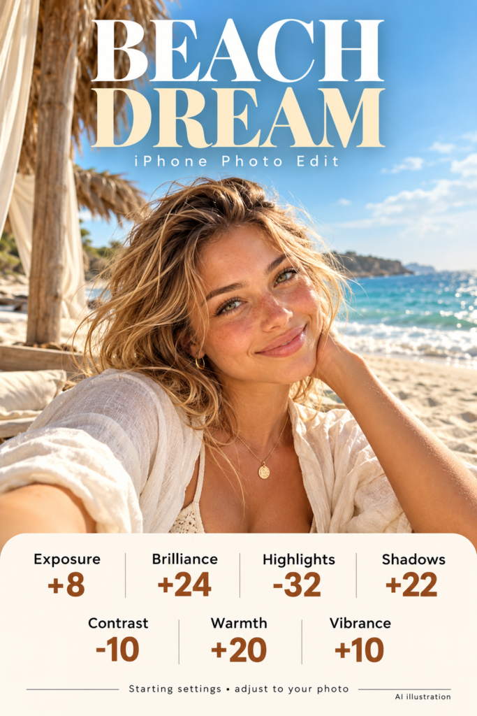
Best for: Daylight beach portraits, pale linen, sand, and casual holiday snapshots.
Beach Dream aims for an open, warm look with softer contrast. It suits ordinary vacation photos where you want to keep the cheerful feeling rather than turn the whole scene moody. Start with a reasonably sharp photo, because extra brightness will not fix motion blur.
Beach Dream iPhone editing settings
| Adjustment | Starting value |
|---|---|
| Exposure | +8 |
| Brilliance | +24 |
| Highlights | -32 |
| Shadows | +22 |
| Contrast | -10 |
| Warmth | +20 |
| Vibrance | +10 |
Try it in this order: Lift Brilliance and Shadows, then lower Highlights to protect sand and pale clothes. Ease Contrast down and add Warmth. Use Vibrance for a restrained color boost.
If it looks wrong: If the beach looks nearly white, remove the Exposure increase first. If blue water turns green, reduce Warmth.
This is a useful starting point for a vacation photo set, but adjust each frame for its own light.
8. Sun-Kissed: Add a gentle Sun-Kissed glow to daylight portraits
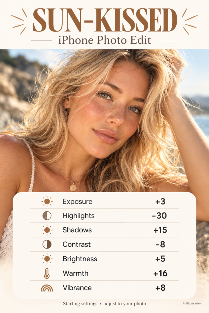
Best for: Outdoor portraits, soft side light, neutral backgrounds, and lightly shaded faces.
Sun-Kissed adds a small warm shift without relying on extreme orange tones. It is a good first portrait recipe because the changes stay fairly gentle. Choose a shot with natural light on the face and some detail in the bright areas.
Sun-Kissed iPhone editing settings
| Adjustment | Starting value |
|---|---|
| Exposure | +3 |
| Highlights | -30 |
| Shadows | +15 |
| Contrast | -8 |
| Brightness | +5 |
| Warmth | +16 |
| Vibrance | +8 |
Try it in this order: Reduce Highlights, then raise Shadows a little. Add Warmth gradually and check the skin tone before increasing Vibrance. Keep Brightness modest so the face still has shape.
If it looks wrong: If skin already looks warm, halve the Warmth value or skip it. If the portrait looks flat, move Contrast back toward 0.
A warm edit can suggest a sunny mood, but the original direction of the light still matters.
9. Forest Glow: Bring out lakes and greenery with Forest Glow
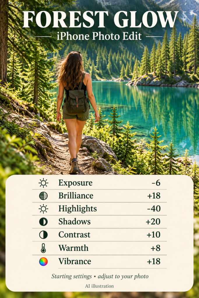
Best for: Forest trails, green parks, turquoise lakes, and outdoor travel portraits.
Forest Glow aims to keep greens lively while giving the scene a little structure. It works best when the photo contains both foliage and something lighter, such as a pale shirt, a path, or water. That contrast keeps a dense green background from swallowing the subject.
Forest Glow iPhone editing settings
| Adjustment | Starting value |
|---|---|
| Exposure | -6 |
| Brilliance | +18 |
| Highlights | -40 |
| Shadows | +20 |
| Contrast | +10 |
| Warmth | +8 |
| Vibrance | +18 |
Try it in this order: Lower Highlights to soften bright water and sky, then lift Shadows to reveal the trees. Add a small amount of Contrast and Vibrance. Keep Warmth low enough that the water stays believable.
If it looks wrong: If leaves become neon, lower Vibrance toward +5. If the forest looks yellow, move Warmth toward 0.
This is the outdoor recipe to try when you want the location to carry as much attention as the person.
10. Dark Warm: Use Dark Warm for a deeper indoor mood
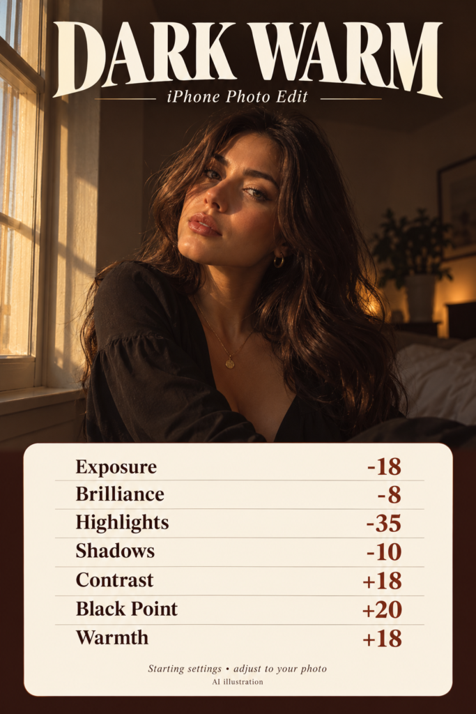
Best for: Window portraits, dark clothing, warm interiors, and simple backgrounds.
Dark Warm favors depth and warm color over brightness. It suits a portrait with a clearly lit face and a darker background. Avoid starting with an already underexposed photo unless you are comfortable keeping the result quite dark.
Dark Warm iPhone editing settings
| Adjustment | Starting value |
|---|---|
| Exposure | -18 |
| Brilliance | -8 |
| Highlights | -35 |
| Shadows | -10 |
| Contrast | +18 |
| Black Point | +20 |
| Warmth | +18 |
Try it in this order: Lower Exposure, then adjust Black Point and Contrast. Pause and check whether you can still see detail in hair and clothing. Add Warmth after you settle the brightness.
If it looks wrong: If the eye area becomes hard to see, raise Shadows and reduce the Exposure change. You want a moody portrait, not a missing person in a dark room.
Choose it for one atmospheric image; you do not need to apply it to every photo in a set.
11. Golden Hour: Give late-afternoon photos a Golden Hour finish
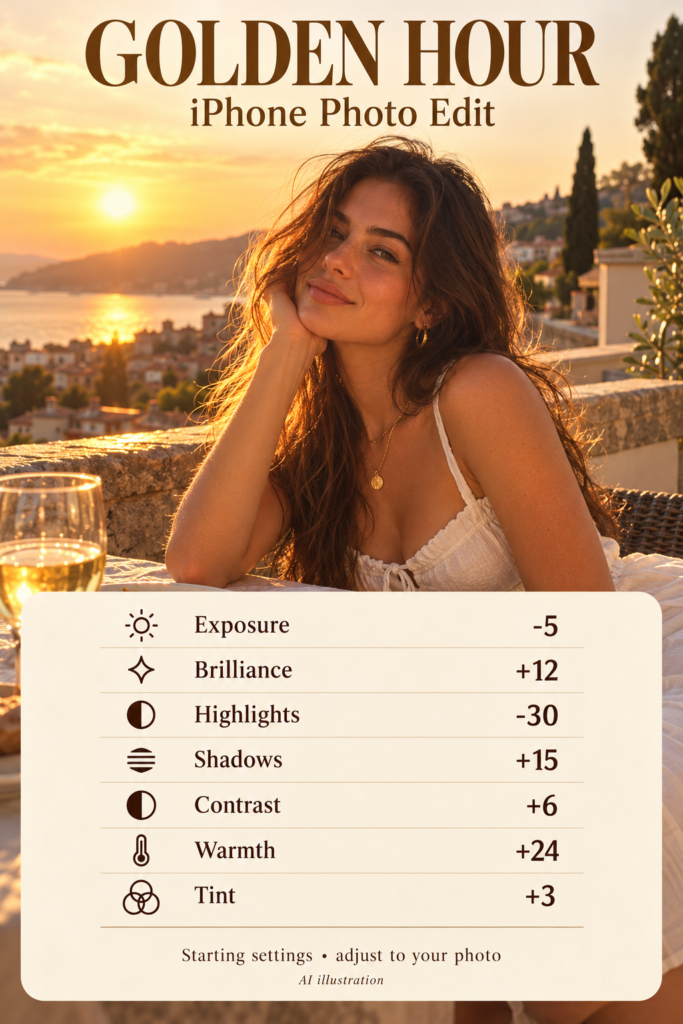
Best for: Existing side light, late-day portraits, sunlit terraces, and warm outdoor scenes.
Golden Hour emphasizes warm light that your photo already contains. It can support a late-afternoon feeling, but the sliders cannot create convincing sunlight from the opposite direction or add natural shadows to a cloudy scene. Use a picture with a little sun on the subject.
Golden Hour iPhone editing settings
| Adjustment | Starting value |
|---|---|
| Exposure | -5 |
| Brilliance | +12 |
| Highlights | -30 |
| Shadows | +15 |
| Contrast | +6 |
| Warmth | +24 |
| Tint | +3 |
Try it in this order: Lower Highlights to soften bright skin, lift Shadows for balance, then add Warmth gradually. A tiny Tint adjustment can help if the scene looks slightly green, but leave it alone when skin already looks right.
If it looks wrong: If everything turns orange, reduce Warmth toward +10. If the image is already golden, use only the light adjustments.
Think of this as finishing real late-day light rather than faking the sun.
12. Digital Camera: Try a Digital Camera-inspired edit for casual snapshots
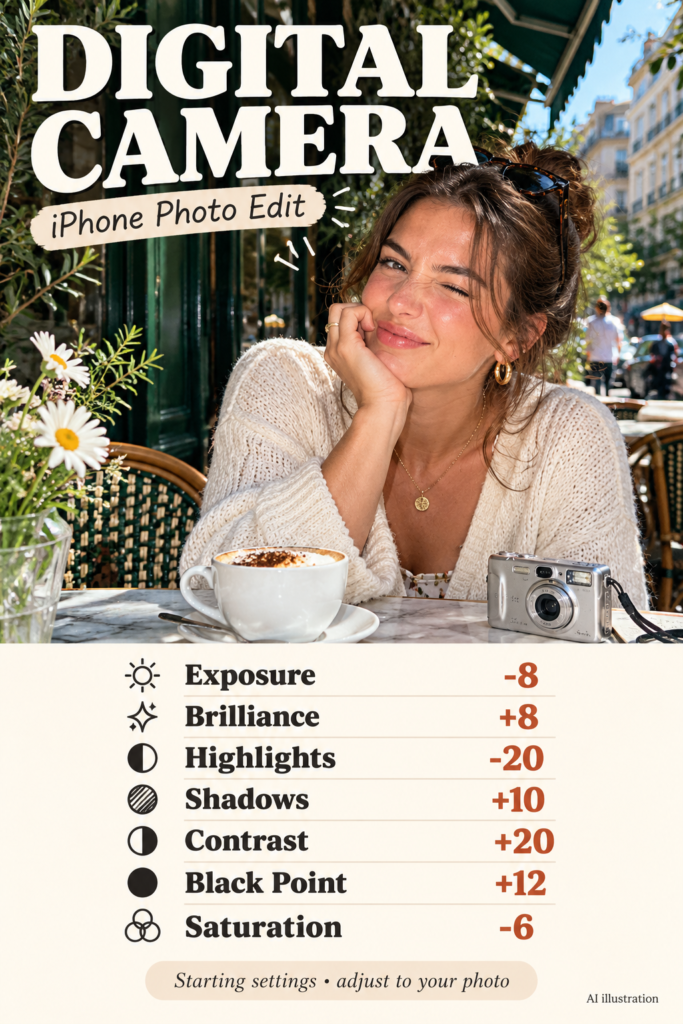
Best for: Direct-flash photos, café snapshots, evening outings, and candid expressions.
This recipe borrows a little of the crisp contrast and quieter color associated with some compact-camera snapshots. The original flash, framing, and scene do much of the work. An edit alone will not recreate the optics, texture, or noise of a particular camera.
Digital Camera iPhone editing settings
| Adjustment | Starting value |
|---|---|
| Exposure | -8 |
| Brilliance | +8 |
| Highlights | -20 |
| Shadows | +10 |
| Contrast | +20 |
| Black Point | +12 |
| Saturation | -6 |
Try it in this order: Add Contrast and a modest Black Point, then reduce Saturation slightly. Bring Highlights down if flash creates very bright spots. Keep Shadows high enough that the background does not vanish.
If it looks wrong: If skin looks dull, move Saturation toward 0. If the background turns black, reduce Black Point before adding brightness everywhere.
Pair the edit with an imperfect, spontaneous composition. A relaxed expression often does more than another ten points of contrast.
Three small checks that make an aesthetic edit feel natural
1. Use something neutral as your color reference
A white shirt, a pale wall, or gray pavement can help you notice a strong color cast. That surface does not have to look perfectly neutral in a warm scene, but it should not distract you. If your white shirt suddenly becomes peach, revisit Warmth and Tint.
2. Keep texture where the photo needs it
Zoom in briefly to check eyes, hair, leaves, and fabric, then return to normal size. Heavy edits can hide detail in dark areas or make bright areas feel harsh. More contrast does not automatically mean a better photo.
3. Match the feeling across a photo set
Use one recipe as your starting point for related photos, then correct each image individually. A portrait in shade and a wide shot in direct sun can need different Exposure and Warmth values. Aim for a similar mood, not identical numbers.
Questions about aesthetic iPhone photo edits
Do I need a paid editing app?
No. These recipes use the built-in iPhone Photos adjustments. You do not need a paid preset pack to try them.
Will the same settings work on every iPhone photo?
No. Lighting, the original image processing, the subject, and previous edits change the result. Begin with the suggested values, then use the correction tip beside your chosen recipe.
Can I use these numbers on Android or in Lightroom?
You can use the look as a visual reference, but do not assume the numbers transfer directly. Different apps use different scales and processing. Match brightness and color by eye instead.
Which recipe should I try first?
Choose October Glow for an autumn scene, Beach Dream for a bright vacation portrait, or Sun-Kissed for a softly lit face. The gentler looks give you room to learn what each control changes.
Can Golden Hour turn a midday photo into a sunset photo?
It can warm the colors, but it cannot change where the sunlight comes from. A photo with existing late-day light gives you a more convincing starting point.
Save the look you will actually use
Start with one photo and one recipe. Keep the changes that improve it, ease back the ones that do not, and stop when the picture still feels like your moment. Save your favorite recipe card to a photo-editing board so the settings are easy to find next time.
